Showing posts with label Decor. Show all posts
I'm just going to put this out there first: I am a green thumb. If I put the effort in, it seems that I can grow any variety of plant without too great an effort. Keeping plants in the house has many benefits, not only for your decor, but they do help to keep air clean and improve overall health. Yes, there's some science behind that claim as well; plants can help reduce stress, make you feel better in general, while improving your ability to concentrate.

I recently passed some advice on to a friend and it has inspired this blog post.

What kind of plant should you get if you are a brown thumb?

image source
Now, I don't entirely believe anyone is a "brown thumb" (or a green thumb for that matter). I believe that taking care of plants is a learning curve like anything else, and until you have some experience with it, you can fail miserably. The first mistake I think most people make is using too much water; when the plant doesn't seem to be doing well, panic sets in and since all most people know how to do is water their plants, they go overboard and eventually drown the poor thing.

In this blog post I don't intend to give a complete course on keeping houseplants alive; there are too many varieties to profile here, and there's a houseplant that is right for every house and windowsill.

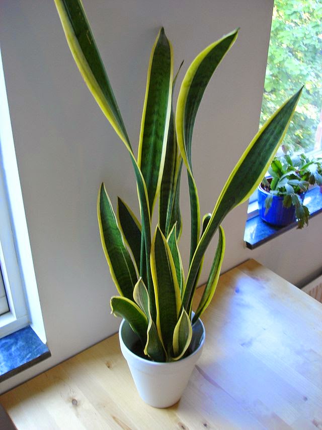
In this post I'm going to profile a single fool-proof plant variety that even the brownest of thumbs can maintain; the sansevieria trifasciata.

That name is difficult to pronounce so let's use it's common name, the snake plant, or Mother-in-Law's Tongue.
image source

The snake plant is a tropical variety native to West Africa from Nigeria east to the Congo. It is easy to find in stores in North America as they are often brought in with flats of various tropical plants in 11" pots. They are quite affordable to purchase and to me appear like over-sized blades of grass. In that sense, they are quite contemporary and stylish.

If you purchase a snake plant in a simple plastic pot, you will want to add a nice heavy pot as this plant can grow quite tall. Be sure to pick one that has drainage holes and a tray, allowing excess water to drain away.

A simple potting soil will do. If you prefer a more streamlined look, you can pot the snake plant directly into a planter with no hole at the bottom, but be sure to line the first two inches of the pot with pebbles and rocks, or even pieces of a broken pot, to allow the plant to drain properly.

The reason I recommend this plant is because it is virtually impossible to kill. The snake plant is incredibly tolerable to low light levels, so it can be placed in a room with no windows and only occasional lighting, such as a basement or bathroom. Of course It also has a very low water requirement, and in the winter months, only needs to be watered every couple of months. Like many plants, it will rot if over-watered, but that is easy enough to avoid. Just give it a half cup of water at a time, and no more. It will survive beautifully.


If you're really concerned about how much to water a plant, try a self-watering planter, which will take all the mystery out of it. Pictured at left is one I love for it's simple contemporary style. (Click the image to view on Amazon.)

I love that the snake plant is architectural and simple, it doesn't shed, and is completely care-free. But what makes it even more awesome? A study by NASA found that it is one of the best plants for improving indoor air quality by passively absorbing toxins such as nitrogen oxides and formaldehyde.

Happy planting!
image source


I recently fell in love with a chair in a decor store. It is the perfect mix of future and retro and it is surprisingly comfortable.

This is it - a Eero Aarnio bubble chair. Aarnio is a Finnish designer who was very popular in the 60's. This chair, designed in 1968 is one of his signature designs and has become a symbol of futurist furniture. I tried it out expecting it to be an odd feeling, better for looking at than sitting in. But I was wrong. It felt like a warm little cocoon and I could have curled up and lived in the thing. 

I considered it, and my budget, for quite some time because it so happened I spotted one in a end-of-line decor shop at a ridiculously good price. Ultimately I decided I didn't know how I would actually get it into my condo and that I'd have to take some measurements. The next time I returned, it was gone. Snooze = Lose.

I recently came across these amazing illuminated bubble chairs by Rousseau commissioned for private project. Rousseau is a design studio in London England that manufactures luxury products, interiors, props and works on bespoke events. This project included a redesign of the bubble chair infusing illustrative artwork and LED lighting to create a piece that could be viewed as art or enjoyed as furniture.


The bubble chair "Information Lounge" at Frankfurt Airport
Considered an industrial design classic, the bubble chair is elegant and simple, but it also is brash and daring. I think that's what appeals to me most, is the way that a simple, colourless geometric design has such impact.

It is comfortable and has an interesting rocking sensation, not at all like any other rocking chair I've spent time in. It's also oddly quiet in the chair, like all outside noise is lessened. People were talking to me while I was in the chair and I zoned out. In my place with the bright west sunsets, I think I'd probably curl up in this chair on a sunny winter afternoon and fall asleep in a few minutes. I like thinking about that already.

There are many knock offs on the market and I know the one I saw was not an original. It's possible that it wouldn't hold up, the acrylic would crack, or the hardware wouldn't be of good quality. Which would be unfortunate, because even the knock-offs aren't exactly cheap. Research tells me an authentic chair will set you back about six thousand dollars, including shipping and taxes. 

I guess I'm putting this one in the dream file for now.

Links: 

Chris Cobb


Chris Cobb
It is possible this trend had it's origins earlier than 2004 but that was the year that artist Chris Cobb did an on-site art installation involving organizing one book shop's twenty thousand books by colour. The exhibition, titled There is nothing wrong with the whole wide world was completed by Cobb and a group of volunteers in one night. The effect (seen at left) was truly magical.

I've noticed that this organizational technique has become a decor trend and it pops up a lot lately in magazines and on blogs. The lovely thing about this is that it creates a sense of order in a room full of books. Have you ever looked closely at an Ikea catalogue, and noticed that the shelves full of books always have white spines? This is because a bookshelf filled with a normal array of books looks messy at best and junky at worst.

But what to do about that little messy shelf filled to the brim with books you love and just can't part with?

This solution is one that creates order in the chaos, is easy, affordable and makes for a really pretty display.Especially if you have colourful books. On that note, I don't advise going out and buying books just because of their colour. That would defeat the purpose of this. Anyhow, I'm seriously considering undertaking this approach with my own library. It creates a sense of peace in me when I look at the books organized this way, I think that's why so many designers are borrowing this idea. I also think I'll be able to find my books faster, because as a visual thinker I tend to remember the cover of a book very easily.

Here are some lovely examples. As always, click to see images at full size.

image source: apartment therapy
image source: design*sponge


source: Better Homes & Gardens


Could you also organize other things by colour to make them look prettier? How about CDs or your Vinyl collection?

I think it would be a great way to organize a collection of kitchen goods, and of course, the classic would be your sock or underwear drawers (if you are the colourful underpinnings type like me.)


Further reading:
Here's an article in the March 2011 Print Edition of Toronto Life Magazine featuring this technique.
An in-depth article on organizing books by colour from Design Observer.
Chris Cobb is also a writer who blogs for the San Francisco MOMA. Here's his page.
The Rainbow of Books flickr photo pool.
Last week I was honoured to receive a Stylish Blogger Award from the lovely Alessia at The Vintage Ramble! Thank you Alessia!

Yay! Such a fun idea, I always enjoy looking at other blogs for inspiration, motivation and joy. The Vintage Ramble chronicles Alessia's business bringing vintage fashion to the home party concept. She will literally bring her awesome-filled vintage closet to your house while you throw a party for your gal-pals and shop to your heart's content. I love the concept so much! Her blog is adorable too, and is chock-full of fun vintage fashion ideas, which you know I love!

Alessia also operates an Etsy Shop for the Ramble and sells handcrafted goods under the banner Six Dollar Goods. Such cute stuff, go check it out.


There are a few rules to the awards:
1. Thank the person who gave you the award and link back to them in your post.
2. Tell us seven things about you.
3. Award seven recently discovered new bloggers.
4. Contact these bloggers and let them know they've received the award.

So here are my 7 Things:

1. I added going to a soccer match in England to my bucket list today. My entire family on my father's side lives in England and I've  never been. I need to go soon! I decided today I will start saving now. It will make a good blog post too.

2. I make mean chicken fingers. It's a simple meal that I always think isn't very special but when I have cooked them for other people they rave about them endlessly and for years afterwards. I pair them with chipolte mayo and dijonaise.

3. I'm going to use a Feng Shui expert to help me layout my condo. It is a little out of character for me to believe in things some people might call hocus-pocus but I've been following some of his tips and they have worked in a way that I actually find a little eerie. I don't care if it is the power of positive thinking, I'm just going to go for it anyhow. I'll blog about it, of course.

4. I love mustard. I recently cleaned out my fridge and discovered I had 6 different kinds: regular, dijon, seeded, horseradish, deli-style and hot. I don't like honey mustard though.

5. I'm hard of hearing. I say 'pardon' a lot and try to look people in the face when they are talking to me so I can see their lips move. I apologize for not hearing people properly all the time and really hate any situation involving speakerphone. I watch movies with the subtitles all the time.

6. My sense of humour is a combination of Archie Comics and Benny Hill episodes.

7. I've been to Detroit on vacation a number of times. It's not high on people's lists of places to go on vacation but I have (well, actually had, they moved to LA!) friends there. The art gallery is great and that city has a lot of character.

And now, for my seven stylish bloggers!

Just Beachy
Inside the Makeup Case
The Bump & Hustle
Hungry Hammered & Home
RuralUrbanist
The Make Den
Pink Blackbird


Stripes are simple, elegant and timeless. In bold size they are able to make a graphic statement while remaining clean and uncluttered in appearance. A fresh take I've noticed around lately is the chevron stripe (also called herringbone).

The interesting thing about this trend for me are the variations that have developed. The look emerged in the past couple of years with other 1980's revivals, but the trend is evolving to include more sophisticated, classic looks like the red bed cover at left, and the grey and white variations below.


This trend has been gaining momentum for the past couple of years, but it hasn't reached a saturation point and probably won't as quickly as something like the black and white brocade print trend.
Chevron patterns have been around for hundreds of years and are used in masonry, textile design and parquetry. Because the design has existed for so long, depending on how it is used it can work in any decor style from classic to modern.
Glassware by Artel
The name "herringbone" comes from the fish, which are well known for having a dense bone structure.

This picture has inspired me, I'd like to have some chevron print pillows for my sofa. Which is orange - hence the inspiration coming from the stack of Hermes boxes beside the blue chevron rug.

I'd also like a stack of orange Hermes boxes, but I think that will require marrying a rich European and then taking up horseback riding, so the chances of that happening are pretty slim.


I also like that this is a DIY-friendly style.
Here's a how-to guide to putting a chevron pattern your walls - even better, it's temporary and can be taken down later!


source
Readers and people that know me well will know about my obsession with orange. There's the orange couch, there's the collection of odd vases, there's the teak furniture with the orange hue, there's the love for halloween. Orange, I'm all about it. I don't wear it a lot, but I love using it in my home and surrounding myself with orange accessories. I also like Orange Crush. And that new Fanta Orange pop is pretty fantastic too. 


A bit about the colour orange:
"Orange combines the energy of red and the happiness of yellow. It is associated with joy, sunshine, and the tropics. Orange represents enthusiasm, fascination, happiness, creativity, determination, attraction, success, encouragement, and stimulation. To the human eye, orange is a very hot color, so it gives the sensation of heat. Nevertheless, orange is not as aggressive as red. Orange increases oxygen supply to the brain, produces an invigorating effect, and stimulates mental activity." 

Associated with Joy, Creativity, Stimulation. Sounds about right. 


Having recently gone through a difficult time and some major changes in life, I'm craving and manifesting a fresh start and I think redecorating is a part of that. After all, 'they' say that your surroundings have deep impact on your emotions. I believe that. I've started in small ways. I changed up a lot in my bedroom. As a result, what I see when I wake up each day is new, and I like that because it makes me view each day as new and revitalized and full of possibilities. 

I want white, white walls (ok, well, craft white but still white) to go with my teak wood pieces, orange sofa and mid-century modern aesthetic. I've got a chair I want to recover to match the sofa and I'm starting to research fabrics. I'd love to find one that combines orange, teal and chocolate brown with a cream. Or maybe even with some lime green and purple. Or perhaps do a contrast with a teal pattern. Stay with me folks - I think it works. Vibrant colour and unique pattern will be the deciding factor in the fabric selection. I love the vibration between teal and orange, and that has been much of my decor inspiration lately. Here are some swatches I've liked and some inspirational pics I've been collecting lately.  What is your favourite colour combination?

by sara morris
source
source
source

source
source

Also, I joined Pinterest. It's fun. Are you a member? Let's be friends if so. It's a place to collect images like this, and share them. Do it!
In a previous job, everyday when I arrived to work it was Christmas. Literally the showroom always had a Christmas section, there was no 'off season'. During that phase, I purchased a lot of cheap ornaments and baubles for decorating the house.

This year, due to some personal shifts and generalized busy-ness, I'm not doing a full-sized Christmas tree. That means my collection of red, white and silver do-dads is staying in the storage unit and I'm only "putting up" my mini Barbie themed tree. It's about 2 feet tall and is decorated with mini disco balls and vintage Barbie doll ornaments. Each year Hallmark releases two different collectible ornaments, the yearly release, which is usually in a horridly large and gross princess dress, and then a historically popular Barbie from the archives.

It's those ones I love best. My mom usually buys me one on Boxing day for half price, that's how I started collecting them! I've got a great series of them and it's almost as much fun unpacking them and putting them on my mini tree as it was playing with Barbies as a kid.

As an aside, I'll mention that I think Barbie has really started sucking lately. Why must all new Barbie toys be pink? Why doesn't she get to wear other colours? As demonstrated by the image at right, this was not always the case. I'm irritated this year by girls toys and how pink they all are, as if little girls shouldn't be allowed to even touch anything navy blue. Don't even get me started on the Disney Princesses! That's another blog post...

This post is about the pink Barbie tree being the centrepiece of my holiday decor this year, and how it's gotten me to thinking about different holiday colour schemes.

The traditional colours of green and red have a long history, and though many theories about why they are the Christmas colours are out there, it's likely because of the use of "Paradise Trees" used in Miracle Plays which were popular in the 15th Century. The plays were used to tell the story of Adam and Eve, and the trees were often pine trees decorated with apples. Evergreens were used because they could be sourced year 'round and kept their lustrous green colour.

image source

Non-traditional colour palettes are so pretty though! Using non-traditional colours isn't really new either, as evidenced by those lovely vintage glass ornaments finding themselves desirable again.

To me the best way to do a non-traditional holiday theme is to include one traditional colour and then go wild from there. Designers use this rule as well, because the traditional colours always sell better than the wild ones at retail. For this reason, collections have a 'safe' base colour and this helps them sell the more wild, contemporary looks.

Use Silver, Gold, Red or Green or White and then have some fun. In my case, I'm using pink and silver!

The hottest trend in decor, fashion and jewellery is definitely still Peacock. A holiday peacock theme uses green, and in this image also uses gold and silver.
image source

With a mix of lovely teal, purple, copper and brown ornaments it creates a lively, warm glow at the holidays.

When you tire of the peacock look in a few years, you are left with gold and silver accents for use in a new theme.

If you use the bright green tone, like in the place setting below, this paired with rich gold or copper is a more traditional spin on the palette.
image source


Also popular this year is Tiffany Blue. Mixed with white and silver, it creates a pretty, glam holiday look.

image source
Reminiscent of snowfall, icicles and jack frost, blue works in the home throughout the season and is perfect if you are planning a new year's eve party as well.  The white and silver elements can be used year after year if you tire of the blue touches. Clear beads and crystals, your plain glass vases and pinecones spray-painted white and silver are affordable ways to add a little oomph to a few blue purchases without breaking the bank.
image source

image source


Coming back to those lovely vintage ornaments, the third holiday non-traditional colour trend I adore is saturated brights like pink, chartreuse, hot red, orange, bright blues. These looks often feature stripes and polka dots and are over-the-top whimsical. And I say if you can't be over-the-top whimsical at Christmas, when can you be?

image credit
Vintage ornaments, plastic holly, hot pink? Kitsch done right! I love the little plastic elves, feathers and jolly snowmen.

image credit


It's so child-like and fun and playful, and is definitely affordable since you can mix and match vintage and dollar store finds easily with this look. I also recommend hitting after-season sales if you're into pink, because it is typically the worst-selling holiday ornament colour, so they boxes are usually left on store shelves on deep discount.

image credit
What colours do you love at the holidays? Are you loyal to tradition or do you like to mix it  up? Do you decorate to match your home decor or have your gotten  your orns as hand-me-downs? This year I'm adding to my decor with some new affordable silver accents like tinsel and silver icicles, just to shake things up. And I'm keeping my pink tree front and centre. I feel like it's time to have a break from tradition.
I've got a new office and it leaves a little to be desired in the view department. I'm not complaining at all, it's just a fact.  It doesn't have a window. Now, I've had everything from the wall-of-windows office to the cubicle-in-the-thick-of-it office and I can say that while I enjoyed the windows, they weren't exactly practical.

A wall of windows is hard to handle when you spend most of your time looking at details on a computer screen. That office with the wall of windows might have looked impressive, but not only was I blinded most of the time, I was sweltering in the summer and ice cold all winter. My office needs to feel comfortable, warm, and most importantly, have candy. If it's got those things, I'm good. 

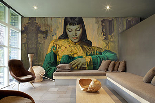
Anyhow, I digress. The reason I've been thinking about those wall paper "instant view" murals from the 70's is related to my lack of windows. You know the kind I mean, right? With the mountains and the rivers and the blue blue sky? Or perhaps a pretty tropical sunset with palm trees?  I'd like to just paste one up, and see the reactions as people walk into my tropical jungle. It at least would be a great conversation starter. Of course I won't do this at work, but it did get me to thinking about my home.


The thing is they are totally back in fashion and there is a lot of selection available. I think it is interesting because they are both wildly old-fashioned (and still making appearances in dated decor like office foyers and community halls) and cutting edge trendy at the same time. This balance of so-lame-it-is-hip is always intriguing to me.


For me liking the look has nothing to do with cool-factor and everything to do with nostalgia. The look above doesn't work for me so much (something about a buck-and-doe headboard doesn't really speak to me) but I am still thinking I want to apply this look somehow in some space of mine.

I found this retro-inspired yellow tree wallpaper mural, and I'm pretty excited about it. Perhaps I'll paste it up on a set of sliding closet doors in my foyer? They are floor to ceiling and white and gross. Think of how cool this would be:


And then there are some really exciting things you can do with a wallpaper mural these days...


Buy guide:


My sister is painting her house. She has wisely hired a professional to do it - with some wide open spaces and....oh, nevermind. I was going to explain why hiring a professional for difficult spaces is a good idea, but really, it's always a good idea to hire professional painters if you've got the cash. They really do the best work. And if you are going to be doing dramatic colours or have colours meeting eachother on the same wall (say, at a corner) then it's probably for the best, because the tiny details can make all the difference.

I've been helping her consider some colour changes in her home and in conversation she asked me if I thought she could go with a deep cool teal green in her dining room, which is opposite, and open to, her yellow kitchen. I definitely think this can work - but the yellow in her kitchen is a bit too sunny - like a Hansa Yellow on the colour wheel below. Because a deep blue green like Aegean Teal by Benjamin Moore has what I like to call a "muddy" tone, I think her yellow will need one as well.

What do I mean by "muddy"? Well, all colours are combinations of dyes and natural elements. Colours aren't always warm or always cool. There are even cool reds! While yellow is warm, by conventional wisdom, it can also have cool variations. As you can see on the colour wheel at left, yellow sits between green and orange. If the yellow leans more to the orange side, it is warm, and if it leans the green direction, it's cool.  The combination I'm talking about in this post is in the ballpark of the Phthalo Blue and Cadmium Yellow shown on the wheel.

You have to be sure to pick a warm, orange based yellow against green/blue, or the yellow will look even more green and acidic.  Cold colours and warm colours can mix in a lovely, dynamic way and because my sister already has beiges and rusty reds as accents, keeping that antique tone to all her colours will really make it work. In essence, with a yellow beige base, she is adding primary colours: yellow, red, blue. In the primary palette, there are two warm colours and one cool. In her house, she would be doing the same thing, though with muddy (think velvet curtains in a castle,  not kindergarten playground) tones of these colours. Her red is just an accent in this scenario, limited to a chair and some wall art. The whole area - the dining room and kitchen - have white cabinets and fire surround, so the colour won't be too overwhelming.

Whichever way she decides to go, I'm now totally inspired by the mustard yellow and muddy teal combination and I made the below moodboard to work it out a bit more in my mind.

(click to see full size)

White always sets off yellow in such a lovely, clean way. The teal against the golden tones looks fresh and modern.  I really love this combination!


I finally bought a sofa. A big glorious orange sofa. I've been wanting to since I got my condo nearly 4 years ago now, and have been suffering through using two of the ugliest sofas known to man that were hand-me-downs. I say "suffering" with some sarcasm because I do realize having two hand-me-down sofas isn't really suffering at all. But the second one really, really offended my aesthetics. Even when I put a giant brown slipcover on it, I could still see those victorian rolled armrests. 

Purchasing a sofa has been no small feat. I'm pretty clear on what I like and dislike and with my budget it has been nearly impossible to find anything other than terrible things like this:


Look. I realize that this isn't the most offensive sofa ever made. In fact, it's pretty good compared to most of the stuff at the Brick or Leons or Bad Boy. But see those puffy rolled arms? I dislike them with the fire of a thousand suns. In fact, the sofa doesn't even really look comfortable. And I wonder if it would dye my white clothes red just from sitting on it.

Unfortunately, this is what people commonly call "contemporary" decor. If the definition of "contemporary" is "of the present time; modern" I don't see how this fits. To me, this is the same sofa that was around in the 80's and early 90's...therefore, not of the present time. What this says to me is that an existing sofa design was updated with new fabric colour. It is a mass market look. I know I'm not like most people in this regard but things that everyone has are things I do not want. I think of it like this - would you want to wear the same dress to a wedding as someone else? If not, why would you want your house to look like everyone elses? I think by purchasing an orange couch, something most people would never do, is a good expression of my consumer personality.

To me mass market furniture is very uninspired. It isn't thoughtful or creative or well designed. It is just what is "in". Red is in = red sofa. I appreciate my style is not for everyone, but having your own style keeps your home looking fresh, regardless of how long it has been since you redecorated.

For example, my sister's house is beige as it's base. Beige walls, beige carpet throughout most of the home. It seems unique and livable however. She's added a cool Todd Oldham for LazyBoy recliner in a multicoloured fabric, has a bright yellow kitchen and has large wall art in beautiful colours that are one of a kind. If you choose to buy what is popular in the mainstream I have bad news for you - your stuff isn't going to look contemporary or 'new' in 10 years. It is going to look like it was purchased in 2008, just like any other trendy item, like gladiator sandals for example. Just like this; which was once called contemporary and looks like it was designed somewhere between 1988 and 1991:

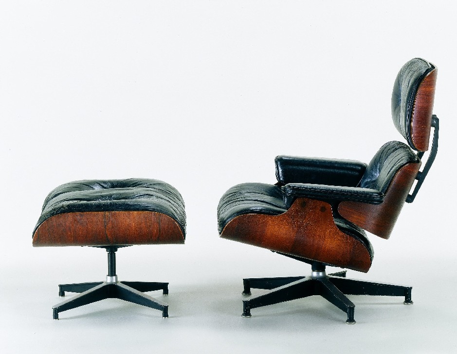
I'm not trying to be some sort of design snob, I'm really not. I simply wish people were more original.  We north americans have been so slow to adopt a modern look, it just came and went in the 50s and didn't stick around or get improved upon at all. In the 80s, there was an attempt, but I fear because it seemed to fail miserably people went running back to nostalgic looks. Like those brand new subdivisions that look like the victorian era exploded all over them. Like sofas that look like they are designed for the Pope to sit on them with doilies and toile and gold threads woven through. Like "country" blue and little white geese in the early 90s. How did we go from Eames chairs to little white geese? What happened? It seems now that time has passed and we've moved on from the Victorian revival yet again, that people are afraid of colour and of expressing themselves. They want 'safe'.


But I don't think it is all consumer's fault. Outside of Ikea and the relatively-new Urban Barn, where do we Canucks have to shop for unique and relatively affordable furniture? Sure sure there's upscale design stores and small boutiques in the big cities. But you know what? I can't afford a $4000 sofa. But is there nothing betwixt the $4000 designer item and the $799 Brick special? Does my budget mean I must suffer through bad design? Isn't the Brick or Leon's capable of selling furniture with unique features? Different styles? I'm serious when I say there wasn't one sofa at any of the big box furniture stores that I would even consider dropping a grand on. My ugly slip covered sofa was better.

I don't think it was always like this. This is a symptom of the mass market world we now live in. Nothing is purchased by retailers in small quantities. This is really the global marketplace taking away our choice. In the case of something like books, mass marketers take away our array of choices, but it is ok, because they give them back on the internet and include free shipping. But in the case of large items like furniture, the choice is taken away and not well replaced by the internet. (Ever looked into the cost of shipping a sofa from LA to Canada?) At one time you might have had a miriad of sofa choices in a wide selections of fabrics to choose from, and the option of customizing your choice for your space, all this made possible because the stuff was produced locally. You now have only the top 20 designs in one colour made in China and shipped in massive containers of only that one design (afterall buying huge quanitites of the same thing keeps prices low). 


Furthermore your sofa doesn't have any shelf life. The design is going to go out of style, but likely no faster than the couch itself will disintigrate into nothingness. No products are made to be permanent anymore. Everything is disposable.


Because everything is disposable (I'm looking at you, 5 year old dvd player on last legs) these days, it doesn't matter if the style is 'classic' or 'timeless' or 'well designed'. Because the retailer is counting on you buying a brand new one within 10 years anyhow. Following the herd to the new trendy look, colour or style.


Furniture that is unique and well designed should last a lifetime. It should appear timeless. You shouldn't look at it and think "wow that reminds me of a boy-girl party I went to in grade 7". This is one reason why stylish people with taste all over america are frothing at the mouth to get their hands on mid-century modern design. It is still fashionable and stylish after all these years because when people made the products, they were making them to last a lifetime. Not a decade.


I'm not saying I have the most timeless style ever or something, I just want to have more options available to me. At this point, some of my best items have been finds at garage sales and thrift stores. Like the two wooden lamps I bought this week, likely circa 1960, with original shades for $15 on kijiijii. Those lamps placed in a decor store on Queen street would have fetched ten times that because the people selling them would appreciate that 1. they are classic, 2. they are original  and 3. they can't be replaced.


There, I just identified them: Those are the three points missing from all contemporary furniture. 1, it isn't classic (has a short shelf life) 2. it isn't original or unique 3 they can be easily and affordably replaced.


I've never really seen lamps like I just bought in a store in my lifetime. But I've seen at least 3000 variations of this lamp:


 I'm honestly not even going to bother to figure out who was the designer that brought these clear based lamps into style because I don't care. It's now been ripped off so many times that it doesn't matter anymore. And I think this is because corporations are so scared of taking risks. They just want safe. They want results for shareholders. They reproduce this in a watered down version. They'd rather rip off every design in their catalog to ensure it is "safe" and has lots of "turns" (product management speak for how many times the stock turns over in the warehouse) so they can make the most money possible every year. I can't blame them for that, but I can feel frustrated by it.


One of the first companies in the US to really begin selling modern furniture, Design Within Reach, has been falling apart recently, because instead of continuing to sell designer furniture like Knoll orignals such as Eames chairs and Barcelona Chairs,  they decided to start selling their own knock-off versions of these. Essentially watered-down cheap mass market 'takes' on the originals. Because they wanted to improve their bottom line. (There's a great article about that mess in a recent Fast Company issue, if you want to read more.)


Why are we north americans so obsessed with fast and cheap? I wonder if it is because our countries are so young, so new that we can't imagine the future. European nations have this perspective on time, because they are filled with buildings thousands of years old. They see that things change, but not really. They appreciate timeless quality and good design because they are well aware that those 'things' could be around for many lifetimes. At least this is my theory. We don't have any perspective on that. Which is perhaps why we continue to recycle 'victorian' over and over again. We keep seeing victorian buildings as 'old' and there is some sort of nostalgic attachment to that style, so we keep recycling it.

People seem to think modern is always cold and minimal. Not so. This was recently confirmed for me by this little home decor style quiz I did that was shockingly accurate. Also for my mom, and another person I know who took the quiz. Try it out and see if it works for you. I got "earthy modern". Which couldn't be more true. I like modern looks, especially mid-century things, and I love warm colours in my decor. I want it to be comfortable and pleasant. I want lots of natural woods and original finishes. Hand made things. I want it to be well designed so that my investments will last. So I must say, the quiz's placement of my style was bang on. I felt it was so bang on in fact, that I celebrated by purchasing my orange deep seat modern sofa.

Must go lounge now.