Showing posts with label Trend Party. Show all posts
Graphic prints have been an important trend over the past few years. Chevron shapes, stripes, polka dots, and houndstooth have all had their moments in the sun. This Spring, I'm spotting gingham everywhere; from shoes to dresses to home decor.

Gingham looks, from left: Altuzarra, Oscar de la Renta and Diane von Furstenberg.Credit

Gingham, which you might associate with Dorothy in the Wizard of Oz, or the lovely Brigitte Bardot (who famously wore pink gingham on her wedding day), is typically light cotton check fabric.


This season gingham was big on the runways. At once retro and innocent, it is also romantic, cheery, and it feels very fresh and new among graphic prints. Certainly an expansion of last year's buffalo plaid trend, this warm-weather version of checkers is available this season on numerous products.
Dolce and Gabbana Dress and Shoe

I'm loving this look-alike-for-less gingham dress by Canadian retailer Simons.

find it here

Gingham in home decor can look a little too "country" for my tastes, but I love this modern kitchen. With the addition of some gingham it's the perfect balance of retro and modern, preventing the look from being too one-note.

img src

Here the gingham is in the pillows, paired with a classic Hudson Bay blanket. Both of these retro styles mix with modern furnishings so well, using colour to do all the heavy lifting in this design. (Check out this entire decor story, actually...it's great.)


I picked up my first gingham piece last summer, a sleeveless black and white gingham shell, and it fit well with almost anything in my wardrobe, adding a touch of retro to my summer style, and it worked well with both casual and dressy outfits. I think that's what I love most of all about gingham; it's casual, and effortless.

What patterns are you craving this year? I suspect I'll be picking up some more gingham before this season is through....

Here's a polyvore set I created using some absolutely swoon-worthy (read fairly unattainable high fashion) items:

Trends are interesting to me because they seem to always hit me the same way. First I hear about something here and there and don't think much of it. Then there's always the wallop. Suddenly in the space of a week or so I'll hear about something constantly. That's what has just happened with Planking. Planking is simple. You lie down, face down, with your arms touching your side in public. Usually you then have a photo taken and post it on the internet. Sometimes it is done as a performance piece over a longer period of time.


Sometimes referred to as "the laying down game" or my favourite, "lazy Parkour", Planking seems to have originated in Australia and has become an out-and-out fad this year. This past May, things started to hit a tipping point when a man was arrested for planking on a police car, and shortly afterwards Australian Prime Minister John Key was pictured with his son, Max Key, planking on a lounge suite. The photo of the PM and his planking son made the front page of a newspaper and soon became a phenomenon.

The internet based version of planking certainly seems to be about absurdity and humour, the joy of capturing the bizarre. Some would call it an internet meme like extreme ironing or flashmobbing.

But what of this other, fine art element? When does it cease to be a plank-prank and become performance art?

Recently the curator of the gallery I work for was at the Venice Biennale, and shared pictures of Canadian (but Beijing-born and NYC-based) artist Terence Koh's installation "Tell it Like It Is" (pictured below.) The installation consists of him laying with his head in an ancient well for over ten hours. While I'm not sure the artist would himself define his performance piece as "planking" it certainly seems to me to be  a similar type of art experiment. Has Terence turned an internet meme/street trend into contemporary performance art? It certainly seems that way, and I'm not the only one to make this pronouncement.


This past weekend I was in Kensington Market, Toronto for their Pedestrian Sundays. I stopped to observe three artists participating in a similar performance piece. Three tall square white pillars were placed on the sidewalk, each with a performer placed on or beside it. In the middle, a man sat on the pillar, but with arms dangling at his sides, bent at the waist with his head between his knees. On either side, the artists leaned up against the pillars, with their noses resting just on top of the pillar, arms at their sides...as if they were 'vertically' planking. With no signage, I was unable to ascertain who the performers were (and also didn't have a camera unfortunately).  Here's a picture I was able to find of a similar performance piece on flickr.

I of course immediately think of planking when I see this because it has the same arresting effect. Especially in the hustle-bustle of Pedestrian Sundays, a completely still figure cuts a sharp contrast to the swirl and noise happening around it.

Observers seemed to look quizzically at the display for a moment or two, then moved along. Some stood and stared for a longer period. We stopped for a moment or two, and during the time we were there the fellow in the position pictured at left seemed to want to stretch his ankles and made tiny movements to do so. I wondered if they were falling asleep. He was careful to keep the rest of his body in the exact posture however, and his two companions were remarkably still during our time there.

While this long-term posing seems closer to what Terence Koh is doing, it also seems similar to me to planking. There is certainly a trend emerging of these long, still performance works. I'm no expert in performance art but I am also calling to mind the work of Marina Abramovic, whose work explores the relationships between performer and audience as well as the limits of the human body and mind. Her work won the Golden Lion Award at the Venice Biennale in 1997 and she had a major installation at the Museum of Modern Art in NY in 2010 called The Artist is Present. 

That seven hundred and thirty six hour long work involved the artist sitting still in a chair, with the possibility for an audience member to sit across from her and look into her eyes for a time. The work gathered much press (especially since celebrities such as Bjork and James Franco were in the audience and participated). Each person who sat with the artist had their portrait captured. Those pictures can be seen here and they are quite haunting.

This stillness - planking in unusual places, leaning on pillars in the midst of a bustling pedestrian-filled street, laying face down for ten hours over a well, or sitting in a chair for over 700 hours is a trend that I can't ignore. I'm not sure what to call it, so I've gone with Planking. If you have another term for me, please share. Perhaps it is the intensity and fast pace of our lives that has led artists to take time to demonstrate the opposite of this life experience through a complete rejection of action and tension.

(I'm posting this blog without discovering who the Kensington Market artist is - if you know, please comment, and I'm also continuing to research it. So if I find out, I'll update this post.)
Read More:
See pictures of planking around the world.
Link to the Toronto Planking Association
"Planking Turns Deadly" via the Globe and Mail
Photos of how the other half lives - Vito Schnabel's party celebrating Terence Koh's installation
Chris Cobb


Chris Cobb
It is possible this trend had it's origins earlier than 2004 but that was the year that artist Chris Cobb did an on-site art installation involving organizing one book shop's twenty thousand books by colour. The exhibition, titled There is nothing wrong with the whole wide world was completed by Cobb and a group of volunteers in one night. The effect (seen at left) was truly magical.

I've noticed that this organizational technique has become a decor trend and it pops up a lot lately in magazines and on blogs. The lovely thing about this is that it creates a sense of order in a room full of books. Have you ever looked closely at an Ikea catalogue, and noticed that the shelves full of books always have white spines? This is because a bookshelf filled with a normal array of books looks messy at best and junky at worst.

But what to do about that little messy shelf filled to the brim with books you love and just can't part with?

This solution is one that creates order in the chaos, is easy, affordable and makes for a really pretty display.Especially if you have colourful books. On that note, I don't advise going out and buying books just because of their colour. That would defeat the purpose of this. Anyhow, I'm seriously considering undertaking this approach with my own library. It creates a sense of peace in me when I look at the books organized this way, I think that's why so many designers are borrowing this idea. I also think I'll be able to find my books faster, because as a visual thinker I tend to remember the cover of a book very easily.

Here are some lovely examples. As always, click to see images at full size.

image source: apartment therapy
image source: design*sponge


source: Better Homes & Gardens


Could you also organize other things by colour to make them look prettier? How about CDs or your Vinyl collection?

I think it would be a great way to organize a collection of kitchen goods, and of course, the classic would be your sock or underwear drawers (if you are the colourful underpinnings type like me.)


Further reading:
Here's an article in the March 2011 Print Edition of Toronto Life Magazine featuring this technique.
An in-depth article on organizing books by colour from Design Observer.
Chris Cobb is also a writer who blogs for the San Francisco MOMA. Here's his page.
The Rainbow of Books flickr photo pool.
Anna Sui Fall 2011
Spring has just arrived and I'm already thinking of Fall colour trends. The Pantone colour report is always released in step with Fall Fashion Weeks. Paris, New York and London have passed and I'm getting excited for a trip to Toronto's edition!

The colour I'm most excited for is deep teal. It's one of my all-time favourite colours! (Especially mixed with orange.)

I never really grow tired of this blue-green shade so I'm happy to see it officially listed as a trend, because that means I'll be able to get my hands on some great examples of it in the next few years.  Delicious paired with saffron yellow, it works well with browns, greys and some greens.

One of the reasons I love this tone is the warm/cool vibration. It manages to sit delicately on the line of cool while still seeming to be a warm fall hue. A perfect colour for all seasons, in my books.

Looking ahead at the fall collections, here are some yummy examples of the colour on the runway. I'll keep my eyes peeled in Toronto for more.

source
Alberta Ferretti Fall 2011
Marc Jacobs Fall 2011


Mackage Fall 2011
Oscar De La Renta Fall 2011
My friend Jennifer's favourite animal/icon is the octopus. I'm a fan as well, though not quite to her level. Though I do have a very large indigo print of a botanical illustration of an Octopus in my livingroom:

Sorry about the terrible shot. It's very bright in here today and getting one without glare proved difficult!

Since I purchased this octopus print about 2 years ago I've watched the animal-of-the-moment change a few times, though I suppose all could still be considered very popular. When I say animal-of-the-moment I'm referring to trends in product design.

The owl is probably at the end of the life cycle, as are deer and birds to some degree. I've noticed (and noted) that wiener dogs are a hugely popular motif right now, and I have to also mention octopi! They've been picking up steam for the last 3 years. As an icon they started out appearing more and more in coastal products, from companies who specialize in creating products that work with coastal home decor. At the same time they gained popularity in fashion circles, especially in jewellery. However in the last six months is when the wiggly-legged fellows have started to really show up on everything.

Octopus as a motif comes along with a whole under-the-water trend. Whales, starfish, jellyfish, octopi, they are all suddenly cute and desirable. Perhaps it the pendulum of trends that has driven our consumer fascination - if we were  last looking to the woodland sky in the form of birds and owls, then perhaps it makes a sort of sense that we now look to the depths of the ocean for our inspiration.

Another way to look at the trend is to relate it back to Steampunk, which is still...(groan) gaining steam in the mainstream. The best way I can explain the connection, knowing little about Steampunk literature, is to correlate the view of Octopuses as intelligent, yet dangerous creatures in science fiction writing. The Victorian fascination with creatures of the sea aligns nicely with the Steampunk fascination with the Victorian era, and the sort-of surreal variations on Victorian imagery the Steampunk movement seems enamoured by...ie:


(surreal Steampunk Victorian era inspired pill box via Etsy)


Here are some more examples of the trend.


Mugs/Cups by Feel More Human


Dish scrubbies by Boston Warehouse (ok I admit I have the white one too, and it works really  well)


Letterpress card by Hello Lucky (hmm, oddly like my wall print!)


Octopus print apron by Anthropologie


A very dignified candle holder from Vagabond House Pewter


Pillow by Thomas Paul via Nautical Luxuries


Octopus-inspired chandelier by Autoban via Remodelista


Wow, how awesome is the Octopus track jacket? It's only $40 us. Hmm. A gift idea! From Etsy.


Check out these earrings! This is from a whole Etsy shop dedicated to selling jewellery molded from sushi-grade octopi: OctopusME.


See if you can spot Octopus jewellery in this deliciously surreal promo video for Bjorg Jewellery


More reading:
A blog called "Everything Octopus"
A list of the best of Steampunk literature


I asked on twitter recently if Macarons were the new cupcake. I think they are fast becoming the treat of the moment. Since then, I've noticed them in virtually every magazine I've picked up, on every design blog, and have seen them in the grocery store when I've never seen them commercially. So, I guess it is official.

Macarons are not macaroons, which I am more familiar with. (Macaroons being the cookies with coconut) Macarons meringue-based: made from a mixture of egg whites, almond flour, and both granulated and confectionery sugar. The confectionery is characterized by its smooth, domed top, ruffled circumference, and flat base. Connoisseurs prize a delicate, egg shell-like crust that yields to a moist and airy interior.

They are so flexible for use in magazines and window displays because of their vibrant colour palette. Though they are more traditionally pastel, lately you will see them in every and any bright colour.

In particular a surge in popularity has happened in New York City, home of the cupcake phenomenon too. You can check out a variety of stores that are specializing in macarons in the New York Social Diary.


As with all trendy things, people love to tell the world about their love for it. We've had years of cupcake plates, tshirts, textile prints, themed events and so on. Mark macarons down as the new delicious food item to put on everything, and anything.

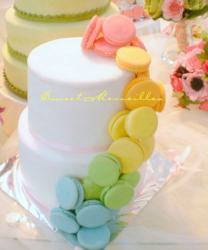
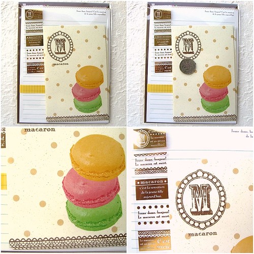
Below: Wall Art, TShirt, Themed Wedding Cake, Stationery, Themed Plates and necklace.
My live-in partner in crime wants a wiener dog. He has for quite some time now. I won't allow it. I don't have anything against the funny-shaped pups, it's just that we live in a condo and both work full time. I just don't think it's fair to a dog to be left alone all day! It is an amusing coincidence that dachshunds are super trendy right now. Perhaps I'll get him a dachshund belt buckle, and that will help tide him over until we have more time and a house with a yard.

Some samples of the trend below!

Kerry Beary - 5x7 print


Emily Bond Dachshund Print Pillow


Gama-Go Clutch Purse


D is for Dachshund Key Chain from Pop Dog Press


Belt Buckle from Lucy Blue Studio


Keep Calm Poster from The Lobster Pot


Red Leather Dachshund Purse from Dutch Design


Pet Lamp from Offi